

What happens when a photograph works on its own, but not with the photographs around it?
Look at this photograph.
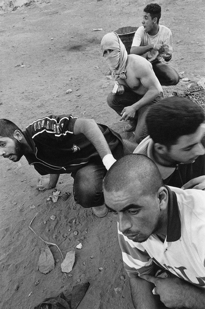
Five young Palestinian men are preparing to throw stones at an Israeli army position.
Ethan Eisenberg1 made it in a town in the West Bank, just outside Jerusalem. He had managed to get close to the men and photograph them from the front.
The photograph seemed to fit naturally into the work he was making. He had been photographing Jerusalem, the West Bank and Gaza for years. This was part of what he had encountered there and he considered it a strong photograph.
The work would eventually become Jerusalem Delivered.
But this photograph didn’t make the book.
As Eisenberg worked on the edit, he began looking at the photograph alongside several others showing riots and arrests. On their own, they recorded different moments. Together, Eisenberg became concerned that they were pushing the book too far in one direction, leaving Palestinians represented primarily through violence. So, late in the editing process, he decided to take it out.
There is one thing about this decision that I keep coming back to.
Eisenberg had not changed his mind about whether the photograph was strong. The problem appeared when he stopped looking at it on its own.
There is a fairly simple explanation for what happened here. Eisenberg already had several photographs of conflict. Adding another one risked repeating something the book was already saying.
But another decision he made while editing Jerusalem Delivered makes this more complicated.
Eisenberg worked on the book with photographer Mark Steinmetz. During one of their sessions, they looked mainly at individual photographs. In another, they concentrated on how the photographs worked together in sequence.
Steinmetz kept returning to two photographs Eisenberg had not valued as highly.
One showed a young Hasidic girl running across an empty lot with an empty baby carriage and the other showed a Christian Orthodox woman kissing the Weeping Stone.
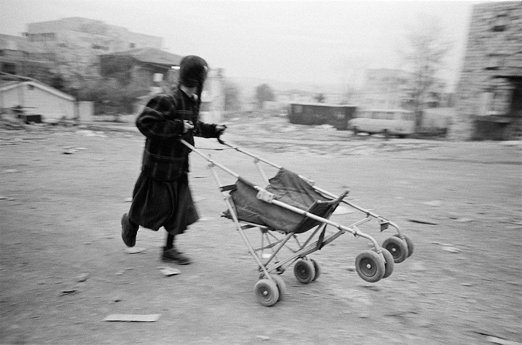
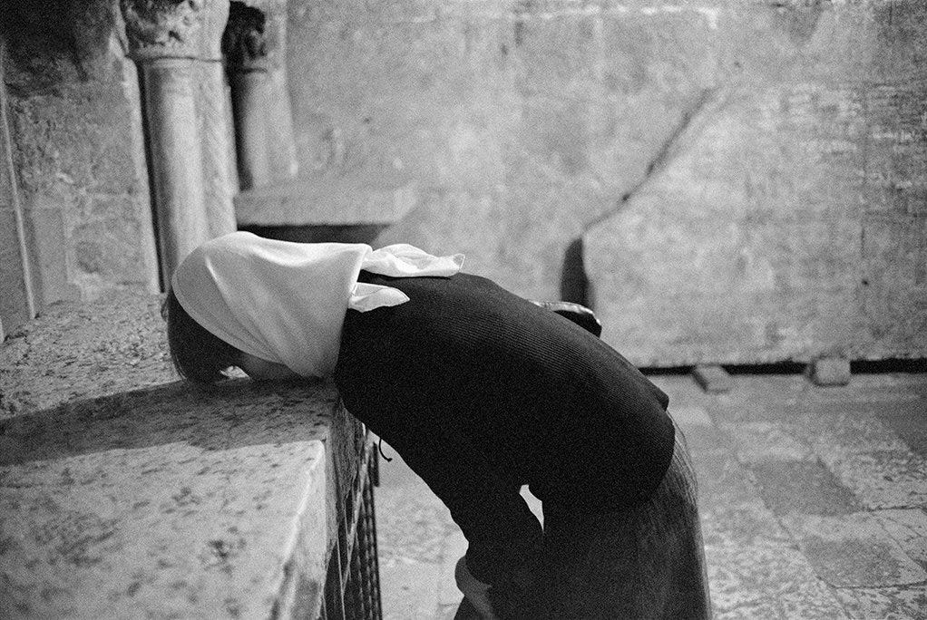
Eisenberg had wondered whether the photographs were too simple.
But when he began seeing them as part of the sequence, that simplicity started to matter differently. He felt the photographs had a gentle quality that helped balance some of the more aggressive images elsewhere in the book.
So something almost opposite had happened.
A photograph Eisenberg considered strong became less useful when he saw it beside the others. Photographs he had initially considered too simple became more useful for exactly the same reason.
This is where his edit becomes more interesting to me.
If editing a project were simply a matter of finding the strongest photographs and removing the weaker ones, neither decision would make much sense.
But Eisenberg was no longer judging only what each photograph could do on its own. He was beginning to judge what each photograph allowed the others to do.
But repetition was not the only reason a strong photograph could become difficult to keep.
Jo Ann Chaus2 ran into a different problem while editing Unspoken. The book grew out of roughly ten years of self-portraits, and she spent more than two years working on the edit.
During that process, an arc began to emerge. Chaus describes it as a movement from being stuck to becoming unstuck, from constraint towards empowerment.
Some photographs simply did not fit that movement.
One of them was Ode to Degas. Chaus considered it a great image, but also theatrical and closer to another genre of her work. Another, Pink Roses, did not speak to the arc that was taking shape in the book.
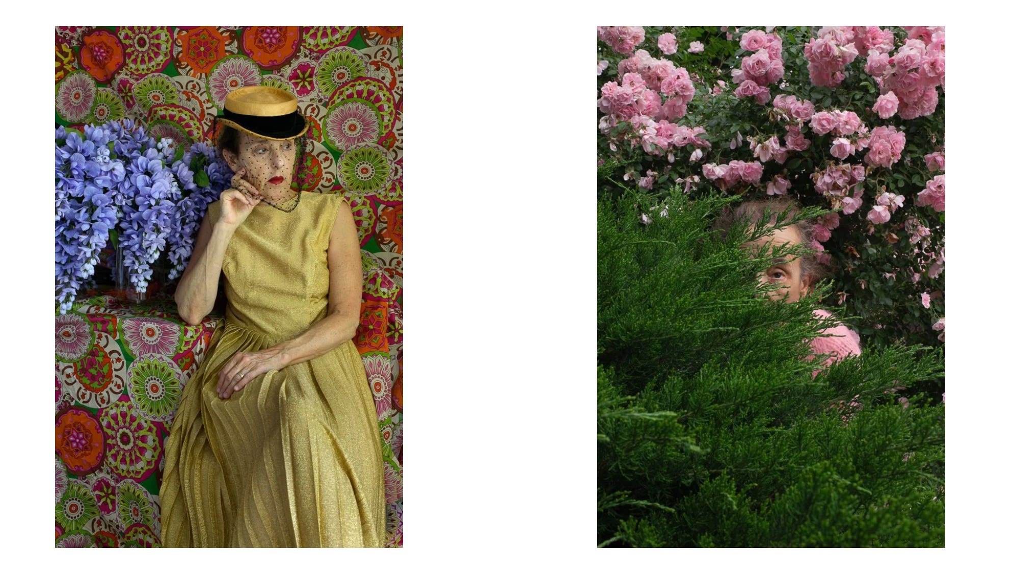
What makes these decisions interesting is that Chaus was not trying to get rid of photographs she thought had failed.
Actually quite the opposite.
Some of the photographs she removed were, in her words, “great as stand-alone pictures.”
They still had to go.
By this point, the question was no longer only whether a photograph was good enough to be included. Chaus had started asking what she wanted the book to say, and whether each photograph supported that.
A photograph could therefore succeed perfectly well on its own and still belong to a different version of the work.
To me this seems to be a harder decision than simply choosing between a good photograph and a bad one. Because once photographs have to work together, being good is no longer the only thing we are asking of them.
What changes is the job we are asking them to do.
And this is where I start to wonder what we actually mean by a “best photograph.”
We usually use the word best as though photographs can be placed on a single scale. One is stronger than another, so naturally we keep the stronger one.
But a project introduces another kind of value.
A photograph can be strong on its own and still become the wrong photograph once it has to become part of something larger.
Sandra Cattaneo Adorno3 has already appeared in this publication for almost the opposite reason. In an earlier issue, I looked at how one successful photograph she made in Santa Monica led her towards something worth pursuing.
But when I was writing that article, I also noticed something else.
For Fragments of Light, Cattaneo Adorno was not choosing photographs for just one form. The exhibition included prints, a photomosaic, large curtain panels and a projection in which 55 photographs gradually transformed into one another.
Each form required her to look at the photographs differently.
For the mosaic, she needed a composition that would still work when divided into separate panels. The projection required something else. There, she paid attention to visual flow and to how lines and shapes in one photograph interacted with those in the next.
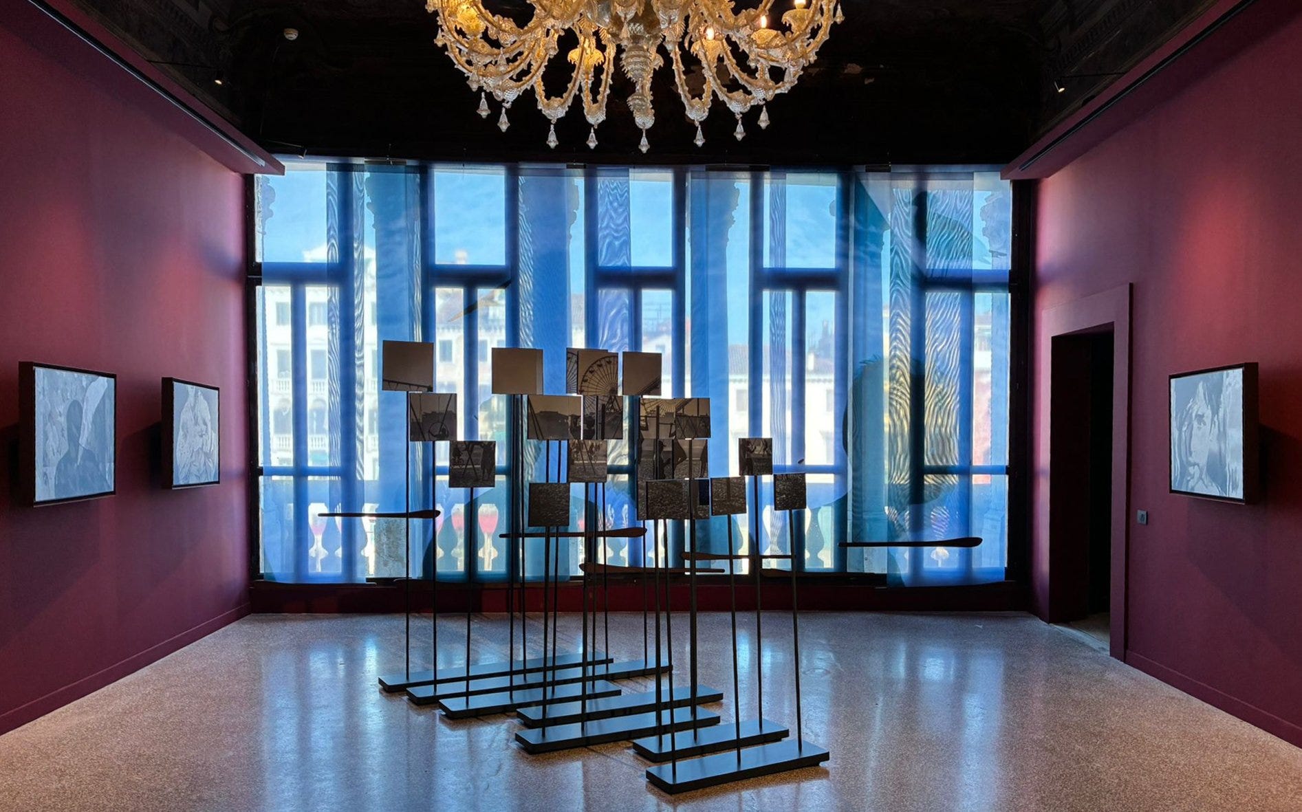
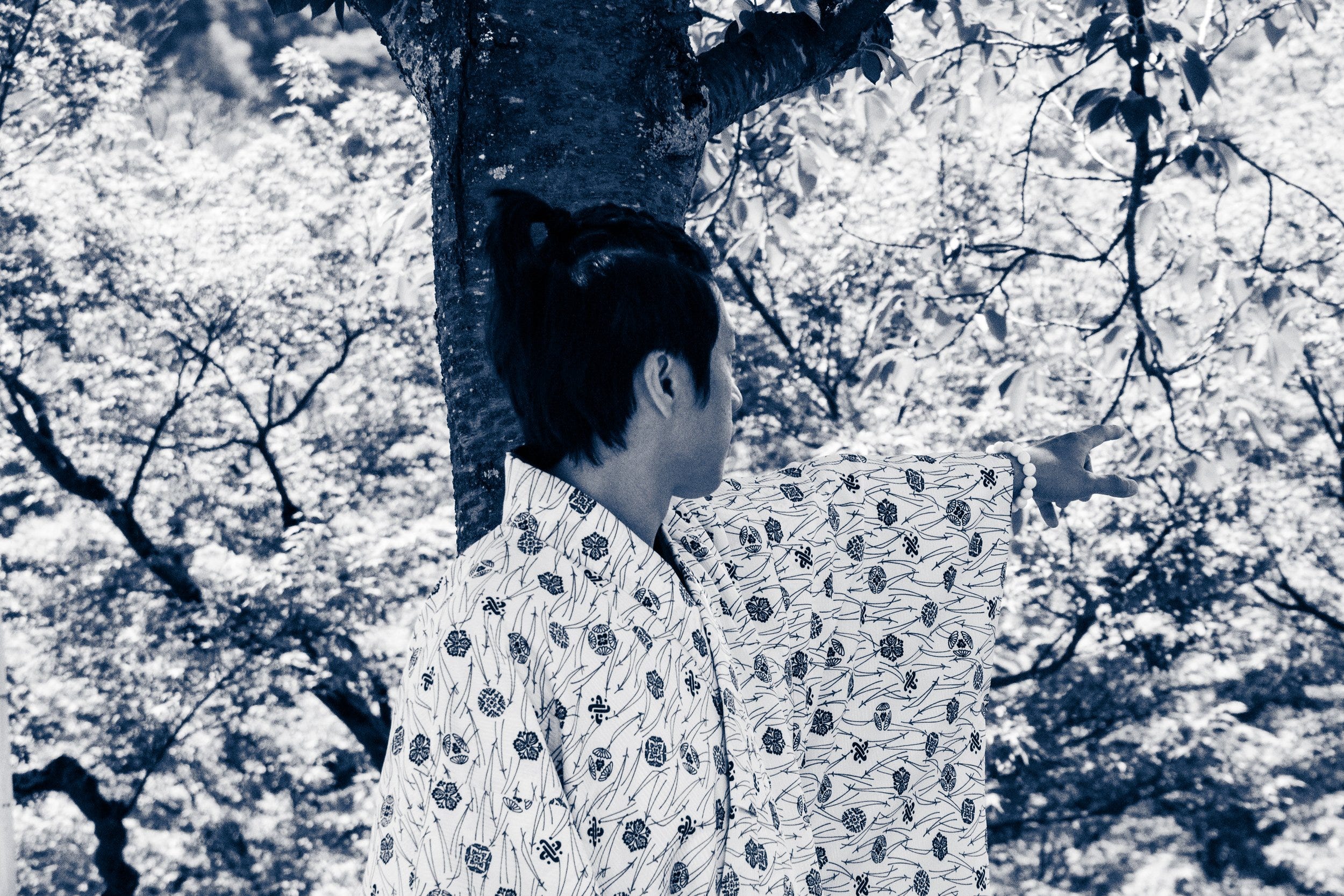
What I find really interesting is that, for the projection, Cattaneo Adorno was thinking more about how the photographs interacted with each other than how they worked as individual frames.
With Eisenberg and Chaus, the question was whether a strong photograph still belonged once it became part of a book. With Cattaneo Adorno, even the way the photographs are shown can change what she needs from them.
A photograph selected for an individual print is not necessarily the photograph she would select for a mosaic or a projection. Each form asks something different of it.
That does not make one photograph better than another.
It means that before we can decide which photograph is best, we may first need to know what we are asking it to do.
Think again about Eisenberg’s photograph.
Nothing about the five young men inside the frame had changed. Eisenberg still considered it strong.
What had changed was what the photograph was being asked to do beside everything else in the book.
We become used to asking which photographs are our strongest. But once those photographs have to live together, that may no longer be enough.
There is another question:
What does this photograph do here?
Martin
P.S. Next Friday, I’ll look at how photographers discover patterns in their work they never consciously set out to photograph. I am looking forward to seeing you around.
Ethan Eisenberg, Jerusalem Delivered - My interview with Ethan Eisenberg about Jerusalem Delivered, the late-stage conflict photograph he removed from the book, and the sequencing session with Mark Steinmetz that elevated quieter images.
Jo Ann Chaus, Unspoken - My interview with Jo Ann Chaus about Unspoken, the two-year editing process, the book’s arc from constraint towards empowerment, and why some great stand-alone photographs were excluded.
Sandra Cattaneo Adorno, Fragments of Light - My interview with Sandra Cattaneo Adorno about Fragments of Light, how different presentation forms changed image-selection criteria, and how the 55-image projection was shaped by visual flow and the interaction between photographs.